https://learn.microsoft.com/en-us/users/princeparkyohannanhotmail-8262/transcript/dlmplcnz8w96op1
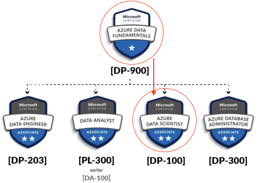
ASSOCIATE CERTIFICATION: Microsoft Certified: Azure Data Scientist Associate
CERTIFICATION EXAM: Designing and Implementing a Data Science Solution on Azure (Exam DP-100)
Data Scientist Career Path
- Learning Paths: Create machine learning models
- Option 1: Foundations of data science for machine learning (complete course)
- Module: Introduction to machine learning
- Module: Build classical machine learning models with supervised learning
- Module: Introduction to data for machine learning
- Module: Explore and analyze data with Python
- Module: Train and understand regression models in machine learning
- Module: Refine and test machine learning models
- Module: Train and evaluate regression models
- Module: Create and understand classification models in machine learning
- Module: Select and customize architectures and hyperparameters using random forest
- Module: Confusion matrix and data imbalances
- Module: Measure and optimize model performance with ROC and AUC
- Module: Train and evaluate classification models
- Module: Train and evaluate clustering models
- Module: Train and evaluate deep learning models
- Option 2: The Understand data science for machine learning (selected modules from option 1)
- Module: Introduction to machine learning
- Module: Build classical machine learning models with supervised learning
- Module: Introduction to data for machine learning
- Module: Train and understand regression models in machine learning
- Module: Refine and test machine learning models
- Module: Create and understand classification models in machine learning
- Module: Select and customize architectures and hyperparameters using random forest
- Module: Confusion matrix and data imbalances
- Module: Measure and optimize model performance with ROC and AUC
- Option 3: The Create machine learning models (selected modules from option 1)
- Option 1: Foundations of data science for machine learning (complete course)
- Learning Paths: Microsoft Azure AI Fundamentals: Explore visual tools for machine learning
- Learning Paths: Build and operate machine learning solutions with Azure Machine Learning
- Learning Paths: Build and operate machine learning solutions with Azure Databricks
COURSES
DP-090T00: Implementing a Machine Learning Solution with Microsoft Azure Databricks – Training
Azure Databricks is a cloud-scale platform for data analytics and machine learning. In this course, you’ll learn how to use Azure Databricks to explore, prepare, and model data; and integrate Databricks machine learning processes with Azure Machine Learning.
- Module: Get started with Azure Databricks
- Module: Work with data in Azure Databricks
- Module: Prepare data for machine learning with Azure Databricks
- Module: Train a machine learning model with Azure Databricks
- Module: Use MLflow to track experiments in Azure Databricks
- Module: Manage machine learning models in Azure Databricks
- Module: Track Azure Databricks experiments in Azure Machine Learning
- Module: Deploy Azure Databricks models in Azure Machine Learning
DP-100T01: Designing and Implementing a Data Science Solution on Azure
This course teaches you to leverage your existing knowledge of Python and machine learning to manage data ingestion and preparation, model training and deployment, and machine learning solution monitoring with Azure Machine Learning and MLflow.
- Module: Design a data ingestion strategy for machine learning projects
- Module: Design a machine learning model training solution
- Module: Design a model deployment solution
- Module: Explore Azure Machine Learning workspace resources and assets
- Module: Explore developer tools for workspace interaction
- Module: Make data available in Azure Machine Learning
- Module: Work with compute targets in Azure Machine Learning
- Module: Work with environments in Azure Machine Learning
- Module: Find the best classification model with Automated Machine Learning
- Module: Track model training in Jupyter notebooks with MLflow
- Module: Run a training script as a command job in Azure Machine Learning
- Module: Track model training with MLflow in jobs
- Module: Run pipelines in Azure Machine Learning
- Module: Perform hyperparameter tuning with Azure Machine Learning
- Module: Deploy a model to a managed online endpoint
- Module: Deploy a model to a batch endpoint
My Learnings.
# Calculate the number of empty cells in each column
# The following line consists of three commands. Try
# to think about how they work together to calculate
# the number of missing entries per column
missing_data = dataset.isnull().sum().to_frame()

# Rename column holding the sums
missing_data = missing_data.rename(columns={0:'Empty Cells'})

# Print the results
print(missing_data)

## OR
print(dataset.isnull().sum().to_frame().rename(columns={0:'Empty Cells'}))

# Show the missing value rows
dataset[dataset.isnull().any(axis=1)]
EDA
import pandas as pd
# Load data from a text file
!wget https://raw.githubusercontent.com/MicrosoftDocs/mslearn-introduction-to-machine-learning/main/Data/ml-basics/grades.csv
df_students = pd.read_csv('grades.csv',delimiter=',',header='infer')
# Remove any rows with missing data
df_students = df_students.dropna(axis=0, how='any')
# Calculate who passed, assuming '60' is the grade needed to pass
passes = pd.Series(df_students['Grade'] >= 60)
# Save who passed to the Pandas dataframe
df_students = pd.concat([df_students, passes.rename("Pass")], axis=1)
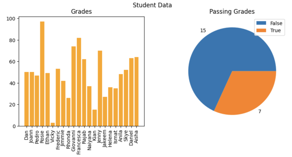
# Create a figure for 2 subplots (1 row, 2 columns)
fig, ax = plt.subplots(1, 2, figsize = (10,4))
# Create a bar plot of name vs grade on the first axis
ax[0].bar(x=df_students.Name, height=df_students.Grade, color='orange')
ax[0].set_title('Grades')
ax[0].set_xticklabels(df_students.Name, rotation=90)
# Create a pie chart of pass counts on the second axis
pass_counts = df_students['Pass'].value_counts()
ax[1].pie(pass_counts, labels=pass_counts)
ax[1].set_title('Passing Grades')
ax[1].legend(pass_counts.keys().tolist())
# Add a title to the Figure
fig.suptitle('Student Data')
# Show the figure
fig.show()
# Create a function that we can re-use
# Create a function that we can re-use
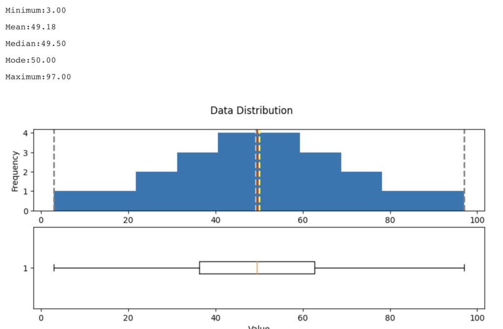
def show_distribution_with_quantile(var_data, quantile = 0):
'''
This function will make a distribution (graph) and display it
'''
if(quantile > 0){
# calculate the quantile percentile
q01 = var_data.quantile(quantile)
print(f"quantile = {q01}")
var_data = var_data[var_data>q01]
}
# Get statistics
min_val = var_data.min()
max_val = var_data.max()
mean_val = var_data.mean()
med_val = var_data.median()
mod_val = var_data.mode()[0]
print('Minimum:{:.2f}\nMean:{:.2f}\nMedian:{:.2f}\nMode:{:.2f}\nMaximum:{:.2f}\n'.format(min_val,
mean_val,
med_val,
mod_val,
max_val))
# Create a figure for 2 subplots (2 rows, 1 column)
fig, ax = plt.subplots(2, 1, figsize = (10,4))
# Plot the histogram
ax[0].hist(var_data)
ax[0].set_ylabel('Frequency')
# Add lines for the mean, median, and mode
ax[0].axvline(x=min_val, color = 'gray', linestyle='dashed', linewidth = 2)
ax[0].axvline(x=mean_val, color = 'cyan', linestyle='dashed', linewidth = 2)
ax[0].axvline(x=med_val, color = 'red', linestyle='dashed', linewidth = 2)
ax[0].axvline(x=mod_val, color = 'yellow', linestyle='dashed', linewidth = 2)
ax[0].axvline(x=max_val, color = 'gray', linestyle='dashed', linewidth = 2)
# Plot the boxplot
ax[1].boxplot(var_data, vert=False)
ax[1].set_xlabel('Value')
# Add a title to the Figure
fig.suptitle('Data Distribution')
# Show the figure
fig.show()
# Get the variable to examine
col = df_students['Grade']
# Call the function
show_distribution(col)
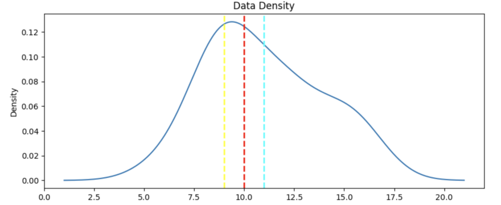
def show_density(var_data):
    fig = plt.figure(figsize=(10,4))

    # Plot density
    var_data.plot.density()

    # Add titles and labels
    plt.title('Data Density')

    # Show the mean, median, and mode
    plt.axvline(x=var_data.mean(), color = 'cyan', linestyle='dashed', linewidth = 2)
    plt.axvline(x=var_data.median(), color = 'red', linestyle='dashed', linewidth = 2)
    plt.axvline(x=var_data.mode()[0], color = 'yellow', linestyle='dashed', linewidth = 2)

    # Show the figure
    plt.show()

# Get the density of StudyHours
show_density(col)
Azure Databricks
Mount a remote Azure storage account as a DBFS folder, using the dbutils module:
data_storage_account_name = '<data_storage_account_name>'
data_storage_account_key = '<data_storage_account_key>'

data_mount_point = '/mnt/data'

data_file_path = '/bronze/wwi-factsale.csv'

dbutils.fs.mount(
  source = f"wasbs://dev@{data_storage_account_name}.blob.core.windows.net",
  mount_point = data_mount_point,
  extra_configs = {f"fs.azure.account.key.{data_storage_account_name}.blob.core.windows.net": data_storage_account_key})

display(dbutils.fs.ls("/mnt/data"))
#this path is available as dbfs:/mnt/data for spark APIs, e.g. spark.read
#this path is available as file:/dbfs/mnt/data for regular APIs, e.g. os.listdir

# %fs magic command - for accessing the dbutils filesystem module. Most dbutils.fs commands are available using %fs magic commands
We can override the cell’s default programming language by using one of the following magic commands at the start of the cell:
%python– for cells running python code%scala– for cells running scala code%r– for cells running R code%sql– for cells running sql code
Additional magic commands are available:
%md– for descriptive cells using markdown%sh– for cells running shell commands%run– for cells running code defined in a separate notebook%fs– for cells running code that usesdbutilscommands